
Lemon and Lime
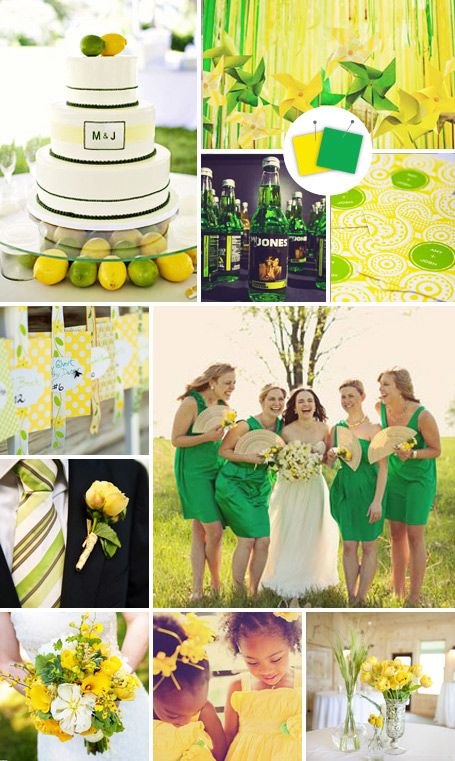
Preppy and fun — this is such an easy palette to pull off. Take it literally and decorate the space with lemons and limes, or just use it as your color guide.
Clockwise from top left: RedTree Photography, W. Scott Chester Photography, Saba Photo, Loneman Photography, Liz Linder Photography, The Parsons Photographers, Millie Holloman Photography
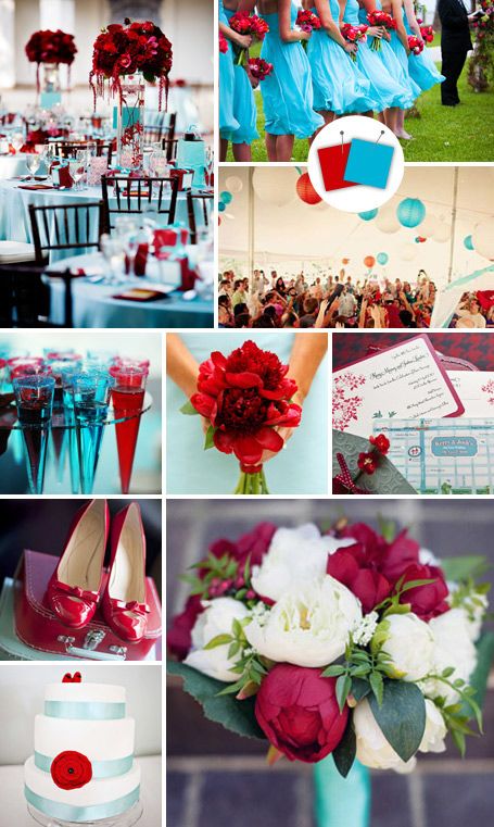
Red, Blue and Yellow
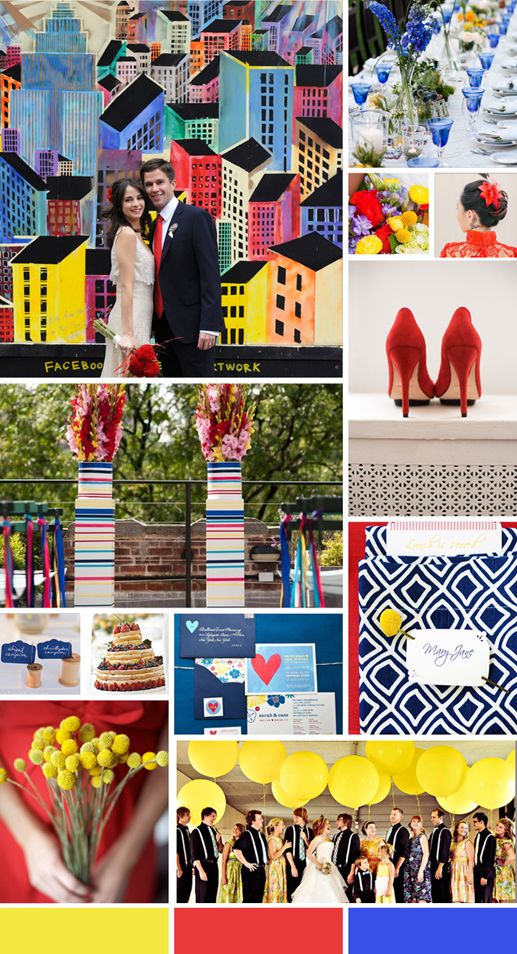
This primary color combination is perfect to create a playful vibe and isn’t for the faint of heart. Think unique craspedia (aka billy balls) for the flowers, an unexpected cake garnished with strawberries and blueberries instead of flowers and a fun geometric pattern for the table linens or napkins!
Clockwise from top left: Ron B. Wilson Photography, Anna Kuperberg, Kris Drake Photography, Our Labor of Love, Sara & Rocky Photography, Julia Newman Photography, Photo by Aubrey, Sarah Logan Photography, Ron B. Wilson Photography, Lissa Anglin Photography
Tangerine and Wasabi
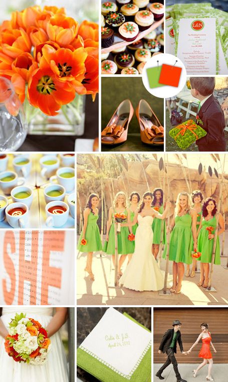
This fresh palette calls for a modern reception space, like an all-white loft or even a fun and funky downtown exposed-brick venue.
Clockwise from top left: Marni Rothschild Pictures, Next Exit Photography, Jennifer Lindberg Weddings, Mark Davidson Photography, Artistic Imaging, Gaston Photography, Jenica Johnson Photography, Mel Barlow Photography, Nashan Photographers, Think Photographics, Adam Frazier
Strawberry and Lime
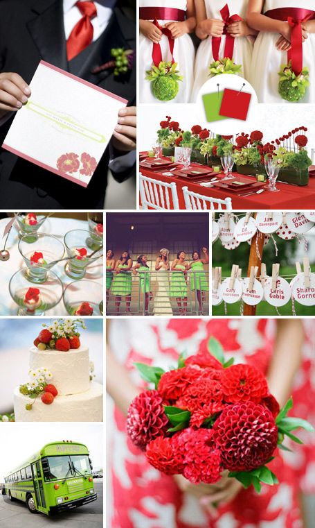
Summertime is the perfect season to break out this bright combo. Bonus: Such flower-friendly colors will be easy on your florist (and your budget).
Clockwise from top left: Julie Mikos Photographer, Julie Mikos Photographer, Antonis Achilleos, Sarah Bastille Photography, W. Scott Chester Photography, Eyespy Photography, Jocelyn Filley Photography, T&J Studios, Tanja Lippert Photography
Peppermint and Aqua
There’s something so playful about this pairing, perfect for a garden country-club wedding or even a laid-back beach wedding.
Clockwise from top left: Boutwell Studio, Amy Martin Photography, Jodi Miller Photography, Kristin Vining Photography, T&J Studios, Mary Kate McKenna Photography, Melia Sorenson
Peony and Nickel
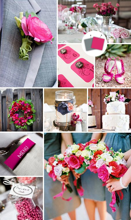
Flirty but not too feminine — we love the way the nickel gray balances out the girlie pink hue.
Clockwise from top left: Kelly Brown Weddings, Nyla Photography, Caroline Johnson Photography, Elyse Hall Photography, Kern-Photo, Carrie Patterson Photography, Jaime Clapp Photography, Anna Kuperberg Photography, Kelly Brown Weddings, Jonathan Canlas Photography
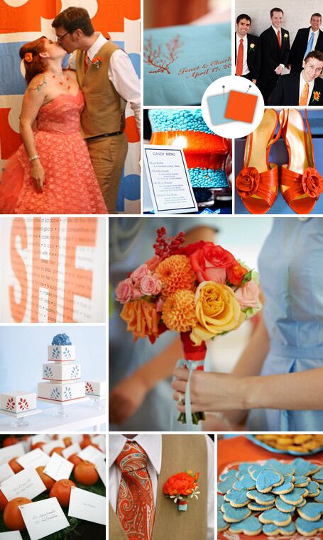
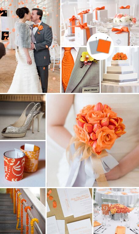
Burnt Orange and Sky Blue

You have to be diligent about the balance of color with such a bold combo, but we love how unexpected the pale blue is when paired with a spicy orange hue.
Clockwise from top left: CHRISSY ALBRIGHT photography, Chris Joriann Photography, Think Photographics, Laffler Photography, Gwyneth Colleen Photography, Antonis Achilleos, Jamie Hammond Photography, Red Loft Studios, Henry Photography
Wintergreen and Lavender
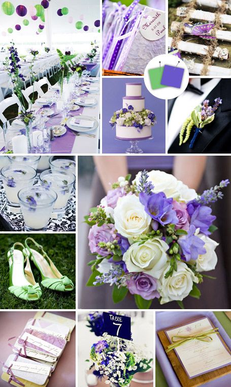
A very approachable and easy to execute combo — purple looks so sweet when paired with soft green.
Clockwise from top left: Kristin Spencer Photography, Gail Chatelain, Life Mosaics, Antonis Achilleos, Shane Snider Photography, Jennifer Colina Photography, ShutterLove Studio, Nick Brown Photography, Strut Photography, Amy Carroll Photography, Jen Fariello Photography
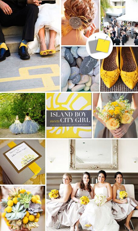
Gray and Lemon

Industrial and mod – introduce a color combo like this on your invites and your guests will get the picture.
Clockwise from top left: Jihan Abdalla Photography, Tom & Jerry Schmidt Wedding Photography, Erin Hearts Court, R Wagner Photography, Stephanie Williams Photography, Lindsay B Photography, Modern Wedding Photography, Dan & Anne Almasy, Perez Photography
Powder Blue and Plum
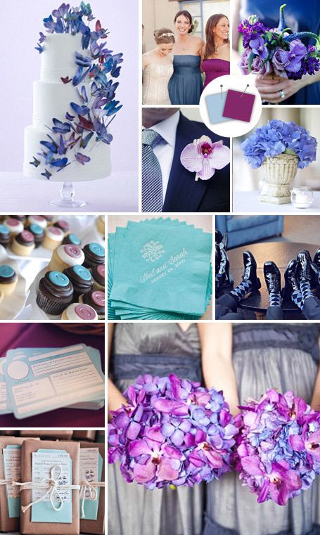
The best part about these colors is how surprisingly translatable they are. Push the deeper plums if you’re having a formal ballroom wedding, or wash your reception in powder blue and little splashes of dark purple for a more casual vibe.
Clockwise from top left: Mark Lund, Erin Hearts Court, Kortnee Kate Photography, Our Labor of Love, Joseph Prezioso Photography, Cleverly Candid Photography, Kim Box Photography, Amy Carroll Photography, Jodi Miller Photography, Julia Newman Photography, Kelly Hornberger Photography
Eggplant and Gobstopper Pink
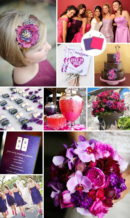
This jewel-toned palette is the perfect pairing for the couple who wants their wedding to look sophisticated — not stuffy.
Clockwise from top left: Woodward + Rick Photographers, Inc., Mitch Ranger Weddings, Kella MacPhee Photojournalist, Antonis Achilleos, Boyd Harris, Steve DePino Photography, Shelly Kroeger Photography, Wendy Maclaurin Richardson Photography, PIX OF LIFE, Amanda Hein Photography
Pumpkin and Slate
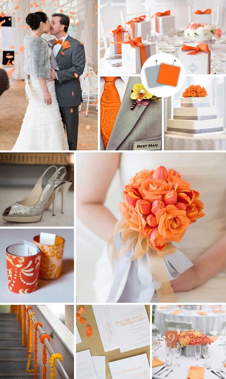
For the I’m-so-not-a-frilly-person bride, we love the way the gray plays down the intensity of the orange to create a modern look.
Clockwise from top left: Corbin Gurkin Photography, Cameron Ingalls, Images By Berit, Ron B. Wilson Photography, Ira Lippke Studios, Zenia Photography & Nicole Caldwell
Navy and Black
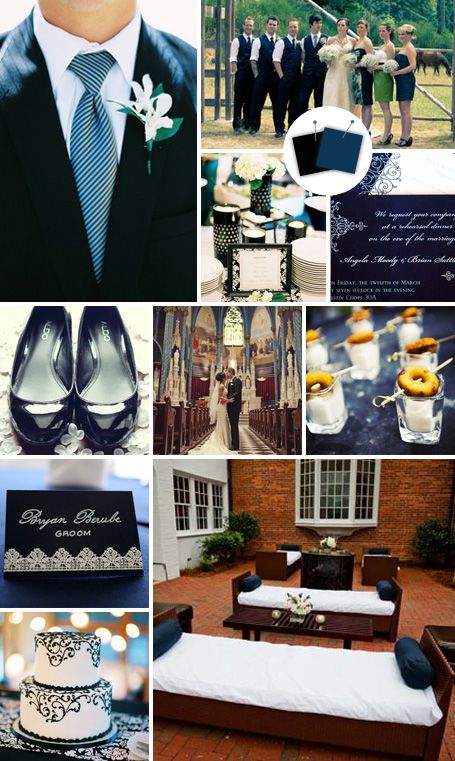
Even though it’s black, there’s something so preppy about it when paired with navy.
Clockwise from top left: Leo Patrone Photography, Orange Passion Photography, VUE Photography, Renaissance Studios Photography, Studio3z Photography, Sam Hughes Photography, Fidelio Photography, Leo Patrone Photography, Shane Snider Photography
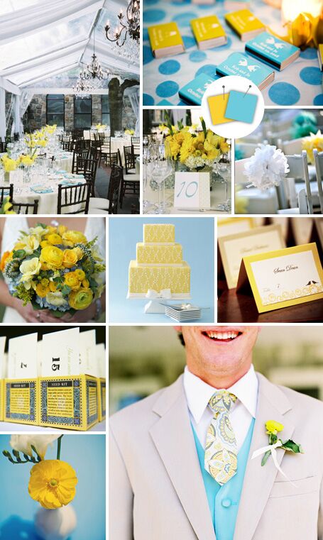
Sunflower and Sea Glass Blue

Perfect for a waterside wedding or even an outdoor springtime reception, pull it off with yellow flowers and blue accents.
Clockwise from top left: Camilla Pucholt Photography, Justine Ungaro Studios, Blue Castle Photography, Audrey Snow Photography, Antonis Achilleos, L Photographie, Liz Linder Photography, Our Labor of Love, Jonathan Canlas Photography
Canteloupe and Grapefruit
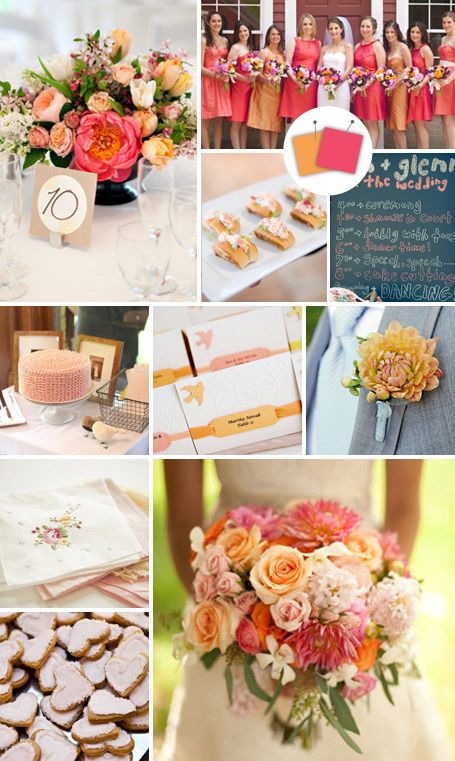
The key to pulling off this combo is to use a more subdued version of both colors so that they complement and don’t compete.
Clockwise from top left: Krista Photography, Heather Parker Photography, Corbin Gurkin Photography, Orange Passion Photography, Photobolic, Klose Photography, Michelle Walker Photography, The Schultzes, Kristin Spencer Photography, Liga Photography
Navy and Fuchsia
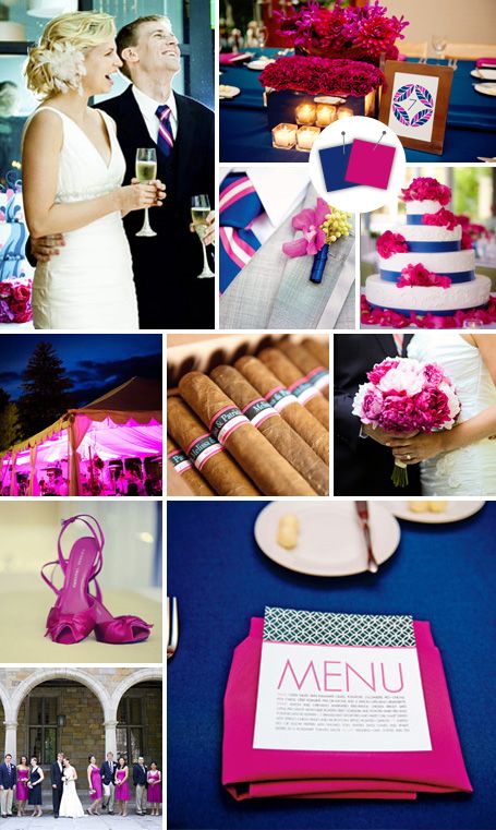
Modern meets preppy with this bold pairing. Just be careful not to overwhelm your entire room with such a bright palette!
Clockwise from top left: The Schultzes, Pen Carlson Photography, BKB Photography, Vlad Foto, Kelly Brown Weddings, Freed Photography, Kristen Taylor Photography
Canary and Cotton Candy Pink
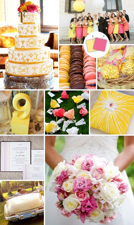
Sweet, simple, and far from boring — bright yellow and soft pink make for one of the prettiest combos.
Clockwise from top left: Agnes Lopez Photography, Adrienne Page Photography, Lauren Rutten Photography, C Studios, Stephanie Williams Photography, Jeff Tisman Photography, Shutter Love Studio, Holland Photo Arts, Javon Longieliere Photography, Tracy Carolyn Photography
Chocolate and Vanilla
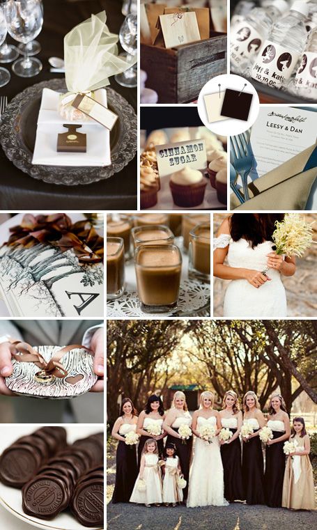
Dress it up or down — you can’t go wrong with such a clean palette.
Clockwise from top left: TANJA LIPPERT Photography, Amy Carroll Photography, Table4 Weddings, Heidi Ryder, Q Weddings, Michael Howard Photography, Jennifer Davis Photography, Leigh Miller Photography, Jen Lynne Photography, Leslie Gilbert Photography, Courtney Dellafiora
Butter and Gold
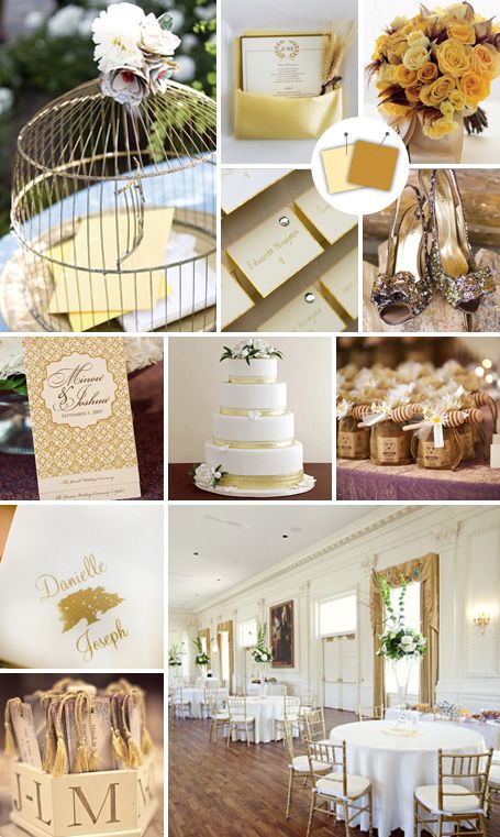
Sophisticated and neutral, think of this combo as the go-to color palette for a formal wedding.
Clockwise from top left: Next Exit Photography, Mark Staff Photography, Mary Ellen Bartley, Ron B. Wilson Photography, IN Photography, Adam Nyholt, Antonis Achilleos, 6 of Four, Millie Holloman Photography, Julia Newman Photography, Taylor Haynie Photography
Cherry and Mocha
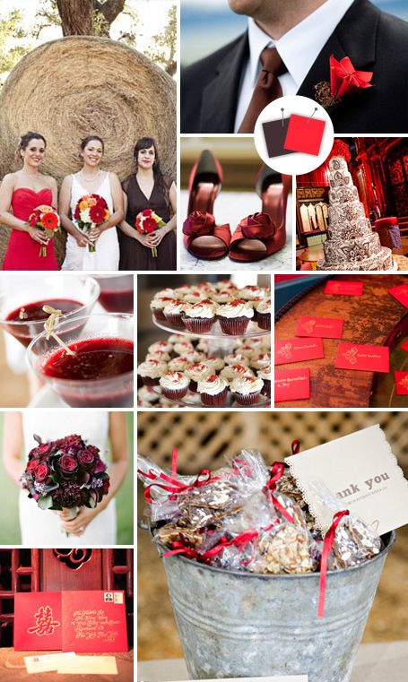
Red is making a comeback, and we love how the brown softens the look.
Clockwise from top left: Bonnie Berry Photography, Emilie Inc. Photography, Open Image Studio, Heather Waraksa, Carrie Patterson Photography, Tamsen Photography, Olivia Leigh Photographie, Jen Huang Photography
Bubblegum and Grassy Green
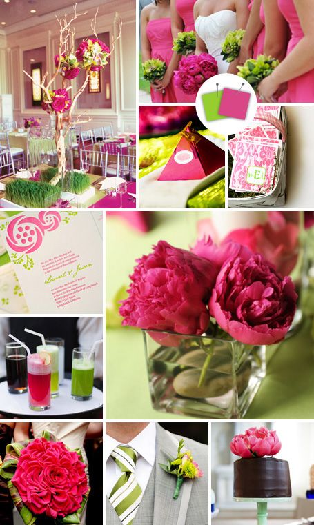
Here, the bright pink just pops when set against a fresh green backdrop.
Photos compiled by Justine Lorelle Blanchard
Clockwise from top left: CHRIS GUILLEN Photography, Phreckles Photography, 6 of Four Photography, Kriech-Higon Photo, Katie Moss Photography/Sugar Plum Invitations, Ira Lippke Studios, Pen Carlson, Next Exit Photography


Related Posts
Marriage Requirements for Morocco
Marriage Requirements for Morocco Necessary Documents: Passport; if divorced, proof of dissolution of any previous Marriage(s); if former spouse is deceased, death certificate; a completed/signed affidavit of nationality and eligibility…
Read more
Destination Weddings: Will My Marriage Be Recognized?
Will My Marriage Be Recognized Will My Marriage Be Recognized – If we get married on a beach in the Caribbean, will my marriage be recognized in the US? First,…
Read more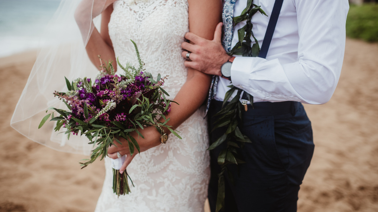
Marrying in the Caribbean: Bermuda Destination Weddings
Bermuda Destination Weddings? Bermuda Destination Weddings – If you love the idea of a Caribbean destination wedding but still want something formal and elegant, consider Bermuda. Just a short flight…
Read more