
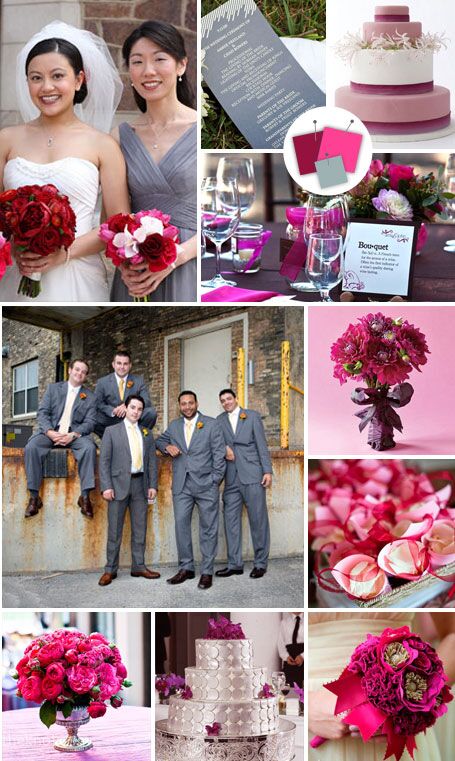
Black + White + Hot Pink
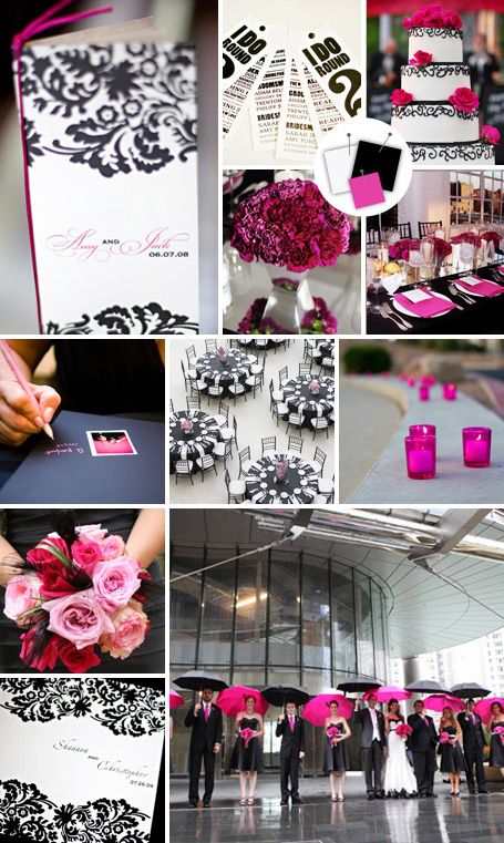
Good for: Modern spring weddings
Tips for pulling it off: Keep the look formal with classic patterns like damask and stripes while adding a style boost with an ultra-contemporary color like hot pink.
Clockwise from top left: Patricia Lyons Photography, Andrew Collings Photography, Inc, Christopher Record Photography LLC, A Photojournalist’s Eye – Jang Photographers, John Michael Cooper, Christine Hall Photography, SNAP Photography, Photography by Rebecca, Colin Lyons Photography
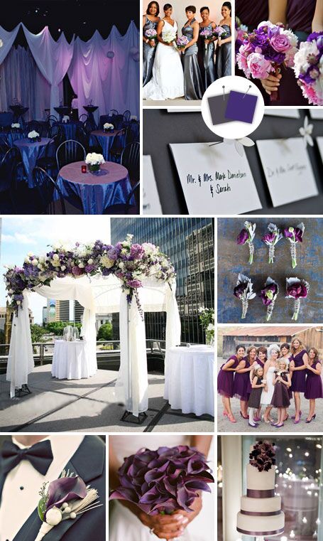
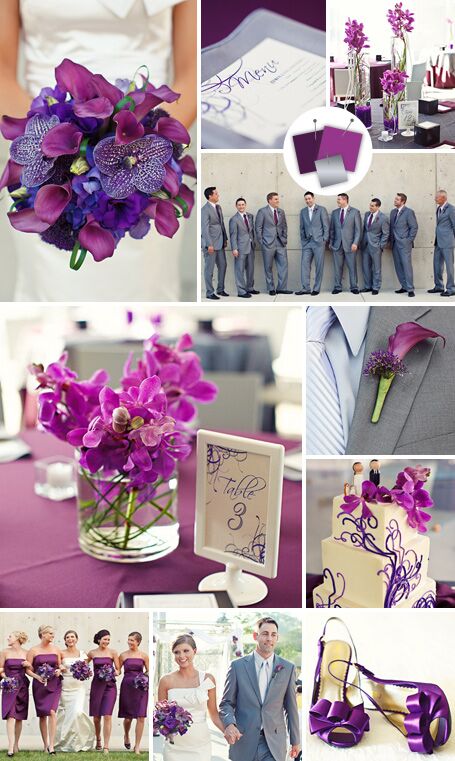
Purple + Lime + Black
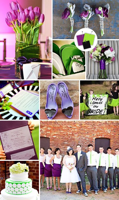
Good for: Hip garden weddings
Tips for pulling it off: Colors this bright can overwhelm easily — unless you mix in a neutral like black or gray.
Clockwise from top left: Baltazar Photography, Corbin Gurkin Photography, Studio Julie Photography, Kay English Photography, Wendy Maclaurin Richardson Photography, Shutter Love Studio, Captivated Images, Barbara Alessandra Photography, VUE Photography
Gold + Silver
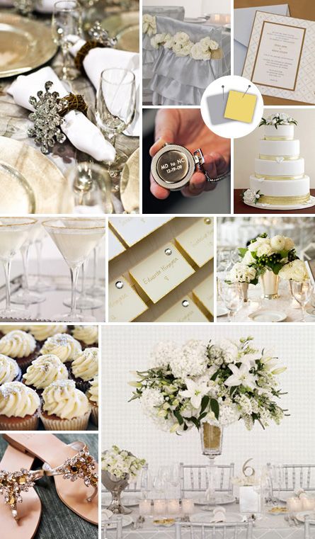
Good for: Formal winter weddings
Tips for pulling it off: Whoever said you shouldn’t mix your metals? This glittery mix adds a punch of style to any affair. Use a variety of textures — from crystals to ruffles — to keep things from looking too two-dimensional.
Clockwise from top left: Sarah Bussey Photography, Rita Maas, Photography by Rebecca, Antonis Achilleos, Ron B. Wilson Photography, Jennifer Davis Photography, Sara & Sarma Photography, Agnes Lopez Photography
Cherry + Yellow + Black
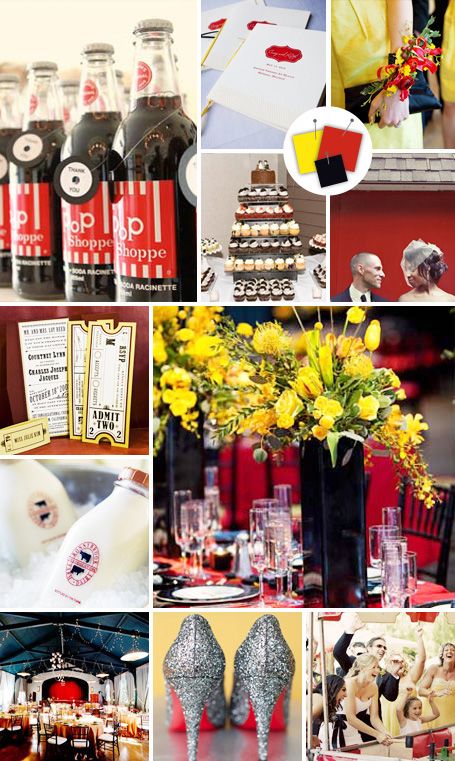
Good for: Upscale backyard weddings
Tips for pulling it off: When you’re playing with primary colors, it’s easy for things to get out of hand. Put a damper on the over-the-top hues with a solid neutral like black.
Clockwise from top left: Renaissance Studios Photography, Alswang Photography, Shutter Love Studio, Victor Sizemore Photography, Sara & Sarma Photography, Olivia Leigh Photographie, Erin Hearts Court
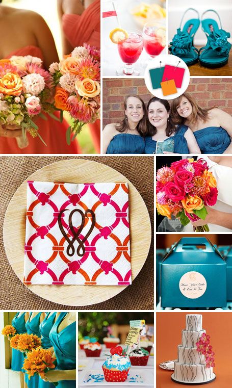
Orange + Yellow + Aqua
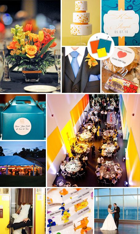
Good for: Low-key summer weddings
Tips for pulling it off: Stuffy couples need not apply. This is a combo that’s all about fun, vibrant color. A fun, patterned wedding cake and energetic lighting will bring it to life.
Clockwise from top left: Kim Long Photography, Antonis Achilleos, Thai Dao Photography, Tracy Carolyn Photography, Brian Dorsey Studios, Jayd Gardina Photography, Continuum Photography, Adrienne Page Photography, Tracy Carolyn Photography, Wren & Field Photography
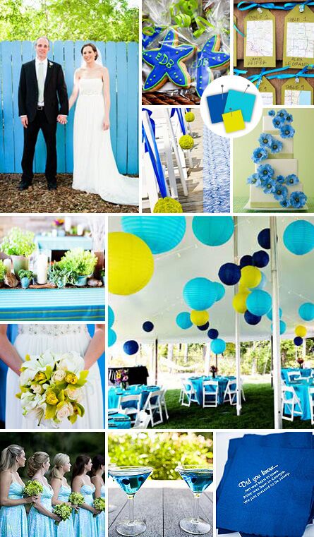
Turquoise + Royal Blue + Electric Green
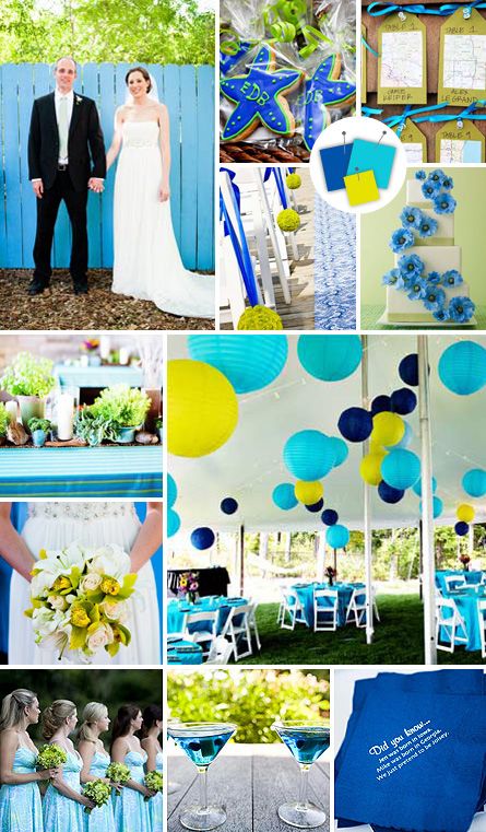
Good for: Afternoon waterside weddings
Tips for pulling it off: This one is virtually impossible to mess up. Subtly vary the shades of blue and green for a look that’s relaxed without looking messy.
Clockwise from top left: D. Lynch Photography, Alea Moore Photography, iKLikphoto.com, Mary Basnight Photography, Antonis Achilleos, Millie Holloman Photography, Genevieve Nisly, Daniel J Photography
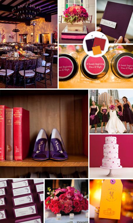
Amethyst + Apricot
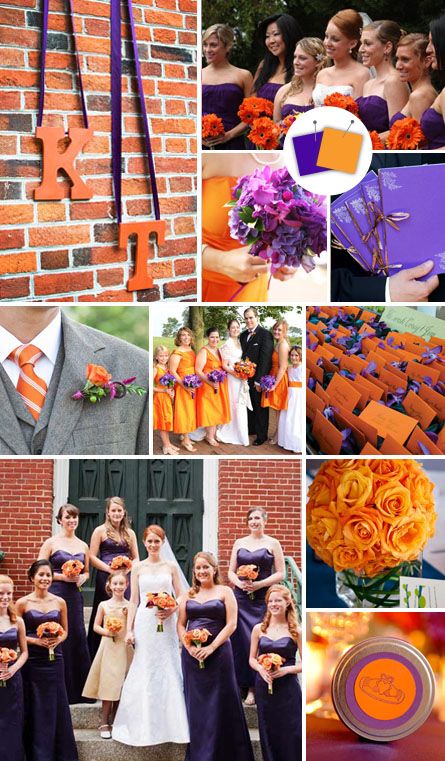
Good for: Laid-back fall weddings
Tips for pulling it off: Look no further than this cheerful palette for a lively shindig. These two brights both crave attention, so keep the rest of the decor subdued — for example, use all-white linens and china.
Clockwise from left: Weddings by Pamela, Creative Force Photography, Atlas Wedding Photography, Missy Photography, Robin Buckley Photography, Sewell Photography, Missy Photography, Studio Atticus, Carrie Patterson Photography, Missy Photography
Black + Yellow + Lime
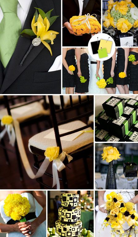
Good for: Modern summer weddings
Tips for pulling it off: These two cheerful highlighter colors help make black seem less formal. To avoid sending your guests into sensory overload, keep the yellow and lime touches bright, but minimal.
Clockwise from left: Lace/Hanky Photography LLC, Kathy Blanchard Photography, Riverbend Studio, Jihan Abdalla Photography, Edyta Szyszlo Photography, Riverbend Studio, Luna Photo, Anne Marie Photography, Jihan Abdalla Photography, BKB Photography
Scarlet + Silver
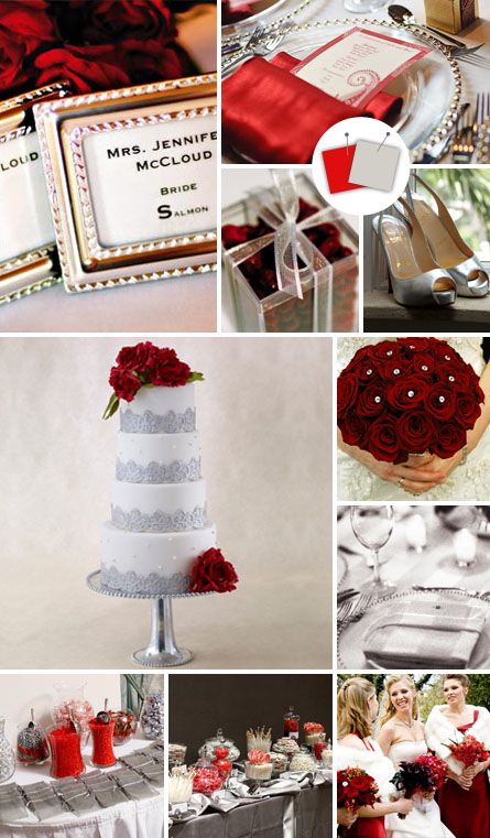
Good For: Luxe modern weddings
Tips for pulling it off: It doesn’t get much more luxurious than polished silver and deep red — just make sure to choose a venue that’s equally grandiose.
Clockwise from left: Mark Garber Photography, Freed Photography, Sea Island Photography, BKB Photography, The Artist Group Photography, Hilary N. Bullock Photography, SMS Photography, Tim McDermott Photography, Studio 306 Photography, Antonis Achilleos
Royal Blue + Marigold
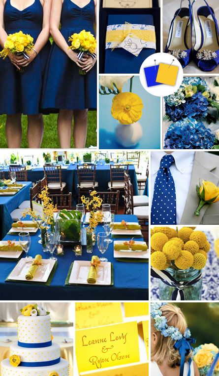
Good for: Preppy summer weddings
Tips for pulling it off: A sunny daytime wedding would get a hit of energy from bright blue and yellow. Stick to the fully saturated shades of these colors in your decor to keep them looking crisp and clean.
Clockwise from left: Becky Young Photography, Genevieve Nisly Photography, Amanda Kraft Photography, Jana Curcio Photography, Our Labor of Love, Orchard Cove Photography, Becky Young Photography, Advantage Photo, Jeremy Lawson Photography, VUE Photography, Jennifer Lindberg Weddings
Maroon + Aqua + Bubble Gum
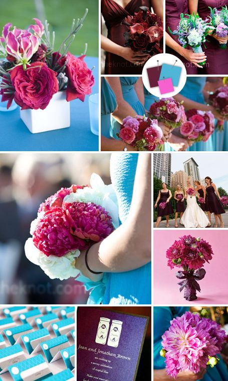
Good for: Playful summer weddings
Tips for pulling it off: In this carefully considered palette, grown-up maroon brings the other two whimsical hues down to earth. During a daytime ceremony, use more of the two brights; then have maroon help transition into a nighttime reception.
Clockwise from left: Maggie Heinzel-Neel Photography, Araujo Photography, Rachael Grace Photography, Maggie Heinzel-Neel Photography, Artisan Events, Antonis Achilleos, Paul Johnson Photography, Wendy Maclaurin Richardson Photography, Kelly Brown Weddings, Jennifer Rau Photography
Cyan + Magenta + Yellow
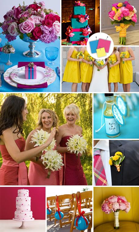
Good for: Bright modern weddings
Tips for pulling it off: This riff on the classic primary colors of blue, red and yellow will add a whimsical twist to any modern wedding. A spare art gallery or loft space provides the perfect canvas for this eye-catching palette.
Clockwise from left: In His Grace Photography, Tuesday’s Frog Photography, Agnes Lopez Photography, Red Ribbon Studio, Jen Good Weddings and Portraits Photography, Jessica Johnston Photography, Marisa Holmes Photographer, Antonis Achilleos, Serendipity Photography
Onyx + Pewter + Cloud
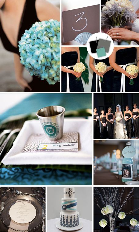
Good for: Formal museum weddings
Tips for pulling it off: We love how this stormy trio is both understated and sophisticated. These hues look best in clean and modern decor, so stick to simple lines and right angles.
Clockwise from left: Mary Basnight Photography, Jill Higgins Photography, Positive Light Photography, Weddings by Pamela, Thorsen Photography, Wendy Woods Photography, Nathaniel Edmunds Photography, Katie Moos Photography, E. Sullivan Photography, Red Fly Photography
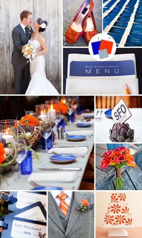
Papaya + Navy + Gunmetal
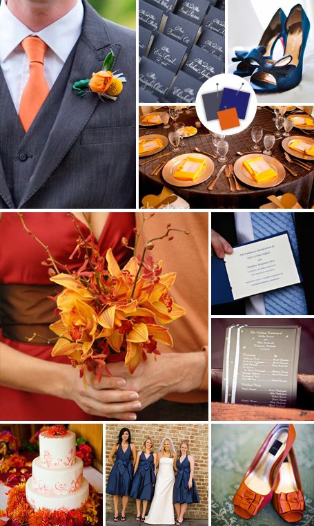
Good for: Formal fall weddings
Tips for pulling it off: Two serious neutrals meet a bright shade of orange to create a color palette with the best of both worlds. For the most sophisticated effect, keep all three hues at their deepest and richest shades throughout the decor.
Clockwise from left: Audrey Hannah Photo, Harry Taylor Photography, Hillary Mayberry, Collins Metu Photography, L’amour de Vie, Julia Vandenoever Photography, Thai Dao Photography, Michael O’Bryon, Laurie Peacock Photography, Susan Jackson Photography
Periwinkle + Sky
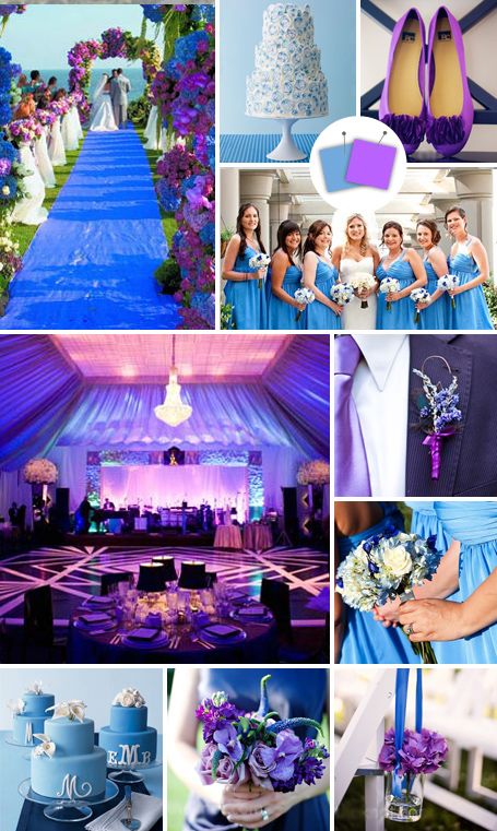
Good for: Bold modern weddings
Tips for pulling it off: Make a statement with this not-so-shy combo. These shades make for rich-looking lighting motifs, so ask your planner about hiring a professional lighting designer to add extra oomph to your reception.
Clockwise from left: Simone & Martin, Antonis Achilleos, Melissa Jill Photography, Agnes Lopez Photography, Nelson Photography, Agnes Lopez Photography, YazyJo Photography, Kortnee Kate Photography, Photography by Mary Ellen Bartley
Stone + Plum
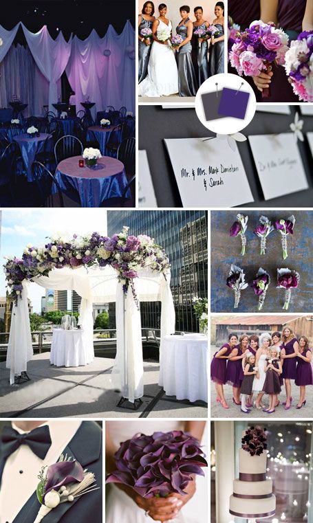
Good for: Modern black-tie weddings
Tips for pulling it off: Both these shades are flattering for attire (your bridesmaids will thank you!), floral arrangements and decor alike. Choose neutrals with a bit of sheen, like pearly whites and silvery grays, to give this palette a little sparkle.
Clockwise from left: Cheyenne Schultz Photography, Gandy Photographers, Ira Lippke Studios, Kris Drake Photography, Corbin Gurkin Photography, Corbin Gurkin Photography, Erik Ekroth, Barbara Alessandra Photography, Heather Saunders Photography, Red Gallery Photography
Coral + Tangelo + Teal
Good for: Casual summer weddings
Tips for pulling it off: Bright and cheery coral and tangelo get a dose of sophistication from teal. Keep decor and stationery designs simple — when these three come together to form busy patterns, the effect can be dizzying.
Clockwise from left: Liga Photography, Jared Wilson Photography, Dustin Images, Dustin Images, Kris Drake Photography, Brian Dorsey Studios, Antonis Achilleos, Boutwell Studio, JoNa Photography, Amber Stricklin Photography
Rouge + Grapefruit + Slate
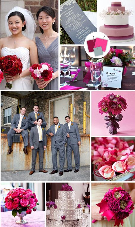
Good for: Formal modern weddings
Tips for pulling it off: Bright grapefruit gets grounded by mature rouge and slate in this sophisticated trio. To keep decor looking chic, make sure one of the two more subtle colors always accompanies the exuberant pink in floral arrangements and table settings.
Clockwise from left: Studio 306, Mark Garber Photography, Antonis Achilleos, Ars Magna Studio, Antonin Achilleos, Jared Wilson Photography, Jen Kroll Photography, Mira Mamon Photography, Laura Novak Photography, Heather Cook Elliott Photography
Violet + Fuchsia + Vanilla
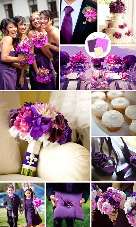
Good for: Luxe modern weddings
Tips for pulling it off: Violet and fuchsia go from girly to glam when splashed with vanilla. A few sparkly accents — metallic wine glasses or jewels wrapped around bouquets, for example — give this luxe trio some extra dazzle.
Clockwise from left: Blaine & Bethany Photography, Clary Pfeiffer Photography, Atlas Wedding Photography, Riccis Valladares Photography, Continuum Photography, D. Bryant Photography, Ira Lippke Studios, YazyJo Photographers, Blaine & Bethany Photography, Artisan Style Photojournalism
Ink + Mulberry + Marigold

Good for: Elegant fall weddings
Tips for pulling it off: This dramatic combo is a darker, fresher take on the pumpkin-and-chocolate palettes of typical fall affairs. Save marigold for the lighting: Show-stopping uplights or gobo lights in this tone will complement the other two shades perfectly.
Clockwise from left: Kim and Niki Photographers, The Nichols, Strut Photography, Lauren Rutten Photography, Artisan Events, Antonis Achilleos, Missy Photography, Christopher Record Photography, Ann Hamilton Photographer, Laura Ivanova
Fire Engine + Rock + Onyx
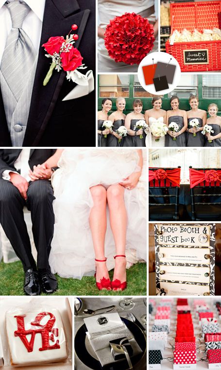
Good for: Formal modern weddings
Tips for pulling it off: Bright fire engine red pops against moody grays in this palette made for a mod, urban venue. Save the red for smaller details (like the escort cards, the guys’ boutonnieres and your shoes) to keep decor looking chic and sophisticated.
Clockwise from left: Lisa Hessel Photography, Emilie Sommer and J Sandifer from Emilie Inc. Photography, Caroline Tran, Perez Photography, Jake Holt Photography, Jen Lynne Photography, Tanja Lippert Photography, Jessica Johnston Photography, Love Me Do Photography, Elizabeth Messina
Cobalt + Persimmon + Slate

Good for: Rustic weddings with a modern edge
Tips for pulling it off: Renting bright-cobalt glassware is an easy way to bring lots of color to your reception tables. Persimmon-colored flowers mixed with slate dusty miller and soft-gray table linens finish the look.
Clockwise from left: Jessamyn Harris Photography, Hillary Maybery, Krista Photography, Millie Holloman Photography, Adi Nevo Photographs, Kim Mendoza Photography, Antonis Achilleos, Carrie Patterson Photography, Adi Nevo Photographs
Lapis + Flame + Chartreuse
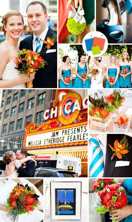
Good for: Casual urban weddings
Tips for pulling it off: Bold and bright, this trio will be the life of the party. Make sure to choose a neutral venue that can provide a blank, white slate for your decor, because this combo can easily clash with other colors.
Photos by: Pen/Carlson
Bordeaux + Wisteria + Silver
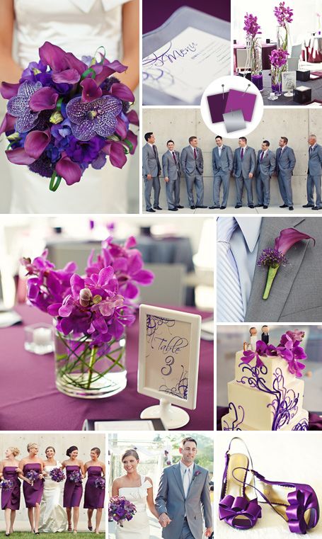
Good for: Modern museum weddings
Tips for pulling it off: This palette shines when used in sleek and minimalist designs, so choose orchids and calla lilies and simple formalwear to celebrate in style.
Photos by: Mary Wyar Photography
Granite + Pine + Thyme
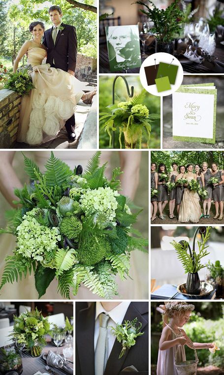
Good for: Modern outdoor weddings
Tips for pulling it off: If you love nature, this is your color palette. Pick a naturally gorgeous outdoor venue and decorate with tons of greenery for a look that’s as chic as it is environmental.
Photos by: Studio 306


Related Posts
Marriage Requirements for Morocco
Marriage Requirements for Morocco Necessary Documents: Passport; if divorced, proof of dissolution of any previous Marriage(s); if former spouse is deceased, death certificate; a completed/signed affidavit of nationality and eligibility…
Read more
Destination Weddings: Will My Marriage Be Recognized?
Will My Marriage Be Recognized Will My Marriage Be Recognized – If we get married on a beach in the Caribbean, will my marriage be recognized in the US? First,…
Read more
Marrying in the Caribbean: Bermuda Destination Weddings
Bermuda Destination Weddings? Bermuda Destination Weddings – If you love the idea of a Caribbean destination wedding but still want something formal and elegant, consider Bermuda. Just a short flight…
Read more